使用Google的全新material design库搭建漂亮的应用
本文将会为你展示控件的基本用法
让我们开始吧!
依赖导入
添加以下代码到正确的地方并刷新项目(不解释了)
1 | implementation 'com.google.android.material:material:1.2.0-alpha03' |
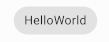
Button
在该库中,Button叫做 Material Button使用方法也很简单
1 | <com.google.android.material.button.MaterialButton |
结果出现了一个错误
1 | java.lang.IllegalArgumentException: The style on this component requires your app theme to be Theme.MaterialComponents (or a descendant). |
解决方法
将styles.xml中的Theme.AppCompat.Light.DarkActionBar改为Theme.MaterialComponents.Light.DarkActionBar
效果如下
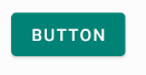
点击的时候还会有水波纹效果
其中,按钮的背景颜色是styles.xml中的colorPrimary,如果要手动更改颜色可以添加app:backgroundTint属性
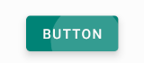
Alert Dialogs
使用方法很简单
1 | new MaterialAlertDialogBuilder(context) |
好吧说实话我并没有看到什么不一样的东西
Switches
1 | <com.google.android.material.switchmaterial.SwitchMaterial |
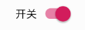
还是一样的效果
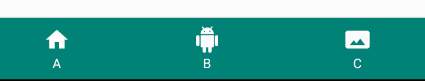
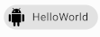
Bottom Navigation
底部导航
布局文件1
2
3
4
5
6
7
8
9
10
11
12
<com.google.android.material.bottomnavigation.BottomNavigationView
    android:id="@+id/bottom_navigation"
    android:layout_width="match_parent"
    android:layout_height="wrap_content"
    style="@style/Widget.Design.BottomNavigationView"
    android:layout_gravity="bottom"
    android:background="@color/colorPrimary"
    app:itemIconTint="#FFFFFF"
    app:itemTextColor="#FFFFFF"
    app:menu="@menu/menu_nav"
   />
其中menu为导航栏显示的内容,需要设置title和icon
在BottomNavigationView中也有一个叫做labelVisibilityMode的属性可以调整文字可见性
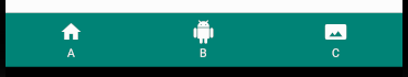
以下是效果
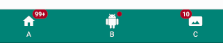
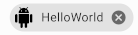
这个组件还可以快速实现类似微信未读消息计数的效果,使用方法很简单
首先,为菜单的每一个item设置id
然后使用下面的代码添加计数组件
1 | bottom_navigation.getOrCreateBadge(R.id.item_1) |
效果如下
Bottom Sheets
一个可以从屏幕底部拉出来的组件
使用方法很简单
首先添加一个androidx.coordinatorlayout.widget.CoordinatorLayout
在内部嵌套你想要从屏幕底部拉出的组件
在该组件中添加三个属性
1 | app:layout_behavior="com.google.android.material.bottomsheet.BottomSheetBehavior" |
其中app:behavior_hideable"为组件是否可隐藏app:behavior_peekHeight 为折叠状态的高度
简单使用的效果

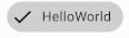
Chips
先上效果图
你还可以点击它
1 | <com.google.android.material.chip.Chip |
你还可以使用app:chipIcon来设置图标
有不同的style可以设置,让chip显示为不同的效果
@style/Widget.MaterialComponents.Chip.Entry
@style/Widget.MaterialComponents.Chip.Filter
还有很多还请自行尝试
监听点击和ChipGroup请看文档
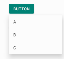
Menu
将以下代码添加到你的Theme内即可快速使用
1 | <item name="popupMenuStyle">@style/Widget.MaterialComponents.PopupMenu</item> |
添加后只需要按照常规的menu添加方法即可使用
显示效果,看起来比自带menu边角更圆一些,也有波纹效果
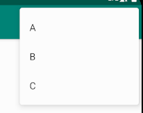
PopupMenu
在其他位置弹出菜单
1 | public boolean showMenu(View anchor) { |
其中,如果anchor组件下方有空间菜单将会显示在它下面,否则显示在上面,你也可以使用setOnMenuItemClickListener来添加监听器
效果
Material Card
好像和常见的CardView没多少区别
1 | <com.google.android.material.card.MaterialCardView |
还有一些小功能,具体请看文档
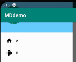
Navigation Views
这个就是常见的侧滑菜单了,使用比较复杂
首先,我们需要一个这样的布局,最外层是androidx.drawerlayout.widget.DrawerLayout,在这个布局内部并列一个CoordinatorLayout和NavigationView
以下是官方示例1
2
3
4
5
6
7
8
9
10
11
12
13<androidx.drawerlayout.widget.DrawerLayout>
<androidx.coordinatorlayout.widget.CoordinatorLayout>
你的布局放这里
</androidx.coordinatorlayout.widget.CoordinatorLayout>
<com.google.android.material.navigation.NavigationView
android:id="@+id/navigation"
android:layout_width="wrap_content"
android:layout_height="match_parent"
android:layout_gravity="start|left"
app:headerLayout="@layout/navigation_header"
app:menu="@menu/my_navigation_items" />
</androidx.drawerlayout.widget.DrawerLayout>app:menu是菜单资源
headerLayout是顶部显示的布局
android:layout_gravity="start|left"可以设置从左边拉出
仅仅是这样来使用它还完全不够,例如没有菜单按钮,导航菜单的顶部也没有覆盖整个界面
透明效果的设置
1 | <item name="android:windowTranslucentStatus">true</item> <!--状态栏为透明,如果设置为false,则没有黑色条盖住,见下图对比--> |
在DrawerLayout添加android:fitsSystemWindows="true"即可让菜单显示到状态栏下方
但是这样做之后还没达到我们想要的效果
为了解决这个问题,我们只能自定义自己的toolbar
首先隐藏原有的toolbar,将主题更改为Theme.MaterialComponents.Light.NoActionBar
在CoordinatorLayout加入以下代码1
2
3
4
5
6<androidx.appcompat.widget.Toolbar
android:id="@+id/toolbar"
android:layout_width="match_parent"
android:layout_height="?attr/actionBarSize"
android:background="?attr/colorPrimary"
app:theme="@style/ThemeOverlay.AppCompat.Dark" />
在Activity中的onCreate加入以下代码1
2
3
4
5
6setSupportActionBar(toolbar)
val toggle = ActionBarDrawerToggle(
this, drawer_layout, toolbar, R.string.open, R.string.close
)
drawer_layout.addDrawerListener(toggle)
toggle.syncState()
其中,两个string资源是对应操作的describe,用于无障碍
最终效果
侧边栏拉出时的动画也是正常的

Snackbars
效果
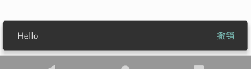
使用方法很简单
1 | Snackbar.make(coordinator, "Hello", Snackbar.LENGTH_SHORT) |
其中,coordinator是一个CoordinatorLayout的id
官方建议将snackbar显示到CoordinatorLayout内,这样就可以启用滑动关闭功能
Floating Action Buttons
就是常见的右下角浮动按钮
1 | <com.google.android.material.floatingactionbutton.FloatingActionButton |
同样也需要放到CoordinatorLayout中,他会自动移动位置使得snackbar不覆盖它
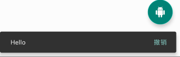
app:tint = "#ffffff"可以让图标显示的颜色变为白色,就算你的资源文件是黑色
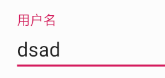
Text Fields
输入内容会自动上移的EditText
效果
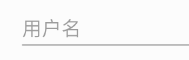
1 | <com.google.android.material.textfield.TextInputLayout |
还有很多操作,具体请看文档
最后
博主此次尝试的组件也只是这个库中的一小部分,还有很多库本人还没有一一尝试,有兴趣的朋友可以自行尝试